UX Movement

Sat, November 13, 2010, 07:10 PM under Links | UserInterfaceDesign

A few months ago I shared a UX blog that I found interesting. Today I'll share another: UX Movement. They have interesting design articles (e.g. this, this, this, this and that) and occasionally shares great UX resources (e.g. this and that).

Let me know if there are other UX resources you recommend…


Are you a GPGPU developer? Participate in our UX study

Sat, July 31, 2010, 02:12 PM under GPGPU | ParallelComputing | UserInterfaceDesign

You know that I work on the parallel debugger in Visual Studio and I've talked about GPGPU before and I have also mentioned UX. Below is a request from my UX colleagues that pulls all of it together.

If you write and debug parallel code that uses GPUs for non-graphical, computationally intensive operations keep reading. The Microsoft Visual Studio Parallel Computing team is seeking developers for a 90-minute research study. The study will take place via LiveMeeting or at a usability lab in Redmond, depending on your preference.

We will walk you through an example of debugging GPGPU code in Visual Studio with you giving us step-by-step feedback. ("Is this what you would you expect?", "Are we showing you the things that would help you?", "How would you improve this")

The walkthrough utilizes a “paper” version of our current design. After the walkthrough, we would then show you some additional design ideas and seek your input on various design tradeoffs.

Are you interested or know someone who might be a good fit? Let us know at this address: devur@microsoft.com. Those who participate (and those who referred them), will receive a gratuity item from a list of current Microsoft products.


User eXperience

Sat, July 31, 2010, 02:09 PM under Links | UserInterfaceDesign

The last few months I have been spending a lot of time designing (and help design) the developer experience for the areas I contribute to (in future versions of Visual Studio).

As a technical person who defines feature sets, it is easy to get engulfed in the pure technical side of things and ignore the details that ultimately make users "love" using the product to achieve their goal, instead of just "having to use" it. Engaging in UX design helps me escape that trap.

In case you are also interested in the UX side of development, I thought I'd share an interesting site I came across: UX myths. In particular, I recommend reading myths 9, 10, 12, 13, 14, 15 and 21.

Let me know if there are other UX resources you recommend…


Zoom Ctrl + mouse wheel

Sun, March 15, 2009, 07:21 PM under UserInterfaceDesign
Almost all modern UIs support zooming in and out; it is useful for focusing on a specific area (e.g. seeing the detail better) and for managing scale (e.g. seeing the big picture without scrolling).

It has become the standard to offer the zooming function via holding down the Ctrl key and scrolling the mouse wheel. Try it now in your internet browser (IE, firefox etc), in any office application (Word, Excel, PowerPoint) including reading or composing email in Outlook, in windows explorer to see more/less files, in Visual Studio 2010 editor and so on and so forth.

If you take one thing away from this blog post as an end user it is to try Ctrl + mouse wheel. As a developer, offer this feature for your users. I recommend a range of 10% to 2000%.

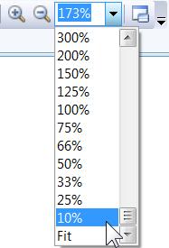
Beyond the standard keyboard shortcut though, there seems to be no standard for displaying a UI zoom control. Below are some screenshots of zoom controls to prove the point.

Word/Excel/PowerPoint, in the status bar:
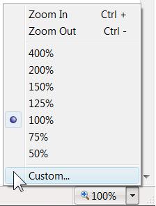
IE7, in status bar:

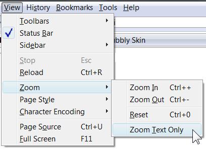
FireFox, hidden in a submenu:

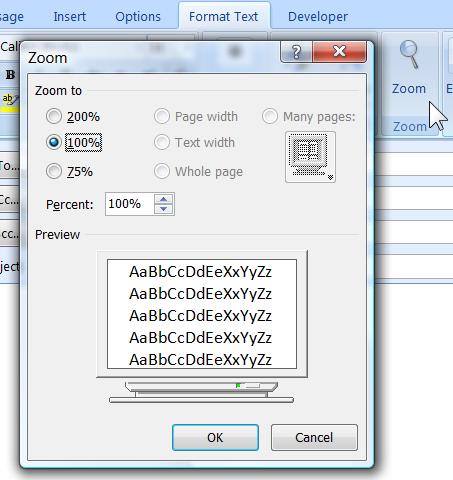
Outlook, hidden in a dialog off a ribbon button:

Windows Photo Gallery:

Class Designer, on a toolbar:


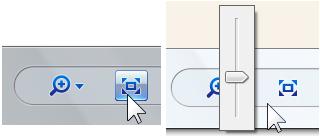
Our team wanted to add a zoom control for a new VS2010 debugger toolwindow. Even within Visual Studio there are various zoom controls. You can see one of them in the screenshots above from the Class Designer (introduced in VS2005). Here is another example introduced in VS2008 for the WPF designer (aka "Cider")

Rather than introduce yet another control that was convenient for us to implement, we decided to follow Cider's example (and also suggested to the UX team to standardize on this for Visual Studio). What I like about this control is that it is quick to use (less mouse travel to get to it than other approaches, and just click and drag instead of combobox clunkiness), I like the way it reports the zoom state at the top e.g. "70%", "x2" and, finally, I love the button at the bottom that toggles between the "fit to screen" and "100%" states. Those of you that used it will have also noticed the aesthetically pleasing fade in/out as you hover on/away from it :-)

Now, even with all these benefits there is a drawback which is acceptable in the WPF designer, but not so acceptable in a smaller surface area (like the typical debugger toolwindow): the control can overlay with the content of the window and, even in the faded out state, it can be annoying for some users. For that reason, we added a toolbar button that simply toggles the visibility of the zoom control. So now you can have your cake and eat it too.

It is amazing to me how smaller obvious features such as adding zoom support, take more time to think over than what one might expect… If you have used zooming in an application that you believe is better than what's described above, please share!

Bad UI Design – ATM

Mon, June 23, 2008, 03:59 PM under UserInterfaceDesign
The goal: to withdraw some cash from one account and deposit it to another. How hard can it be? Isn't ATM user interface design an established known thing? Apparently not, as I found out...

I walked up (with a helper friend) to a cashpoint (the "hole in the wall") which had a big colour screen with buttons either side of it and more buttons in a keypad below. The screen rotated through some adverts and included no instructions as to what do: I inserted my card to make a withdrawal. Nothing happened. We both stared at the screen and start pressing some buttons – nothing. Eventually she went in to the bank to ask for instructions while I continued tapping on the screen and buttons for a little longer. I got bored so withdrew my card... and after a couple of seconds, guess what? It asks me for the PIN number! Wow! You have to pull the card out in order for it to operate... good thing I didn't walk away immediately as the next person could have come along and played "guess the PIN" without ever getting hold of my card! Anyway, in the end the withdrawal succeeded and I had $500 in $20 denominations which is what it gave out. Next step: deposit that cash into another account.

I insert the other card, nothing happens but now I know the trick so I pull the card out and I get prompted for the PIN (after a brief delay). It asks how much I want to deposit. I enter the amount of $500. It dispenses an envelope and instructs me to insert the cash in the envelope and stick it back in the slot; it states that the envelope must not contain more than 10 banknotes! How am I to deposit $500 that it just gave me in 20s by using only 10 notes?! If that is its limitation why didn't it state that before asking me how much I wanted to deposit? This is yet another example of getting the steps in the wrong order. Anyway, since I couldn't find a cancel button (or some other Ctrl+Z option) I put $200 in the envelope and stuffed it in the slot. It gave me a receipt thanking me for depositing $500 :-) By this stage, the person working at the bank comes out and after hearing the story says: "Yeah that happens all the time, I'll correct it on the computer". Sigh.

Why do we put up with such systems? I don't think we'll advance our profession as long as users have already decided to tolerate the crap we serve them.

Bad UI Design – Get your steps in order

Wed, June 18, 2008, 05:20 PM under UserInterfaceDesign
I know there is a generic lesson for UI designers in the mini-rant below...

Recently I had to change the pin of a smartcard that I have which required a number of steps:

Step 1: Insert smartcard into your laptop reader.
Step 2: Run client tool XYZ and click on a button which will auto-populate a textbox.
Step 3: Take the textbox results of Step 1 and paste them on a separate textbox on a webpage
Step 4: Enter in a second textbox on the webpage, the smart card number
Note: this is a number that is never used for anything else and is in small print on the side of the smart card. So I had to remove the card to copy the info.
Step 5: Hit the button on the webpage and check your email
Step 6: wait for email. Read the email (which is also sent to a bunch of approvers) which gives you a string – copy it
Step 7: Paste the string into a second textbox in the client tool we run at step 2
Result: BOOM with a message along the lines of: "The two strings (challenge / response) are not pairs. Please ensure that you do not remove the card during the entire process."

Why couldn't they have started with that statement up front? Why don't they state that next to step 4 at least? Why after removing and reinserting the card, don't they detect and give you a warning that remainder steps are futile? Why don't they take step 4 and move it to Step 0?

Lenovo Fn key

Sat, May 3, 2008, 03:52 PM under UserInterfaceDesign
Very recently I received (from work) a new laptop: Lenovo T61p (to replace my aging Toshiba M5). There are quite a few gotchas with setting up this machine (e.g. I wasted an hour trying to get it to see a second internal drive), but I will spare you my setup/installation experience. Instead, you may be interested in Keith's helpful post here. Generally, I am happy with this machine from a performance perspective.


There is however the quite important issue of its keyboard: it's the laptop keyboard from hell. Why the "£$^&* don't we have a universal standard for laptop keyboards yet? The placement of keys on this laptop is weird (e.g. the ESC key is further up than the top row of keys instead of being aligned with the Function keys) and also keys I usually expect to be more easily accessible than other keys (e.g. up, down, left, right arrow keys) are actually... smaller and cramped close to the others!

However the biscuit goes to the Fn key placement in relation to the Ctrl key. I expected the Ctrl key to be firmly placed in the bottom left and for it to be larger than other keys. Instead, the Ctrl key is normal size and it is 2nd from the bottom left, its place taken by the rarely used Fn key! What is worst is that, apparently, there is no keymapping software that can fix this, since Lenovo in their wisdom have made it permanent in the firmware :-(

One of the worst examples of how this trips me up is copy/paste (Ctrl+C, Ctrl+V). I have some source window where I do a copy (but in reality I only did an Fn+C without realising it) and then close the window, switch to my target window and do a paste (in reality a Fn+V) and nothing happens. Then I realise my mistake but it's too late to do a Ctrl+V now since the copy was never actioned... Arghh!

If you think that I am overreacting, first try using a keyboard like that before passing judgement. If you own one and think I am overreacting, clearly you haven't tried pressing Ctrl+Shift+B (Build Solution in Visual Studio) or Ctrl+Shift+Esc (bring up Task Manager) with just one hand (impossible!). Anyway, it looks like I am not alone judging by the collections of complaints here, here, here and here amongst other places.

My partial solution: I removed the offending key completely (screenshot).

As an unrelated aside, the Mac Air suffers from the same bewildering choice of placement of the Fn and Ctrl keys. As a more related aside, if you see me struggling to type in my upcoming events, now you know why!

<end of rant/>

Bye bye Lotus Notes

Wed, July 27, 2005, 03:38 PM under UserInterfaceDesign
If you haven't used it then I envy you. If you have, then you know as well as I do that Lotus Notes sucks. It deserved the dedicated pages on the Interface Hall of Shame (cannot find the URL right now).

It is easy for me to write a book on the topic but instead here are just a couple of screens I've personally faced that show the quality of the product (since the non user friendliness of it is well documented).

Over the past 6 years I've had this crappy waste of space app installed on two PCs here at home, a tower at work, an older laptop and my current laptop.

Finally, I have a computer in my possession (the tablet I mentioned earlier this month), which I am setting up and the Notes piece of sh1t will not go on it. Combined with the fact that I am changing jobs, this means that I am not going to meet with that abomination any time soon. Anyway, there may be kids reading so, I am going to hold off telling you how I *really* feel (or start talking about Planta PPMS)!